Fintech · B2C UX Strategy Prototyping 2025–2026

Redesigning Self-Directed Investing
with Guided Decision-Making

BMO InvestorLine gives investors full control — no advisor required. But control without guidance creates friction at the moments that matter most. Over 7 months, I owned Journey 2 (Portfolio Understanding) end-to-end — discovery synthesis, flows, and high-fidelity prototypes — collaborating across all three journeys to keep the experience aligned.

Work was divided by journey: UX Designer → Onboarding (J1) · me → Portfolio Understanding (J2) · Lead Designer → Trade (J3). Key J2 concepts were also applied to the empty state — designed for pre-account users to explore the platform before committing.
Role
UX Designer
Journey 2 — end-to-end
Duration
7 months
Sep 2025 – Apr 2026
Team
Lead Designer · UX Designer
· me (UX Designer)
Deliverables
Discovery · Flows
Prototypes · Handoff
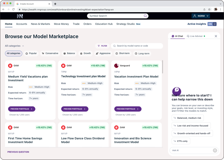
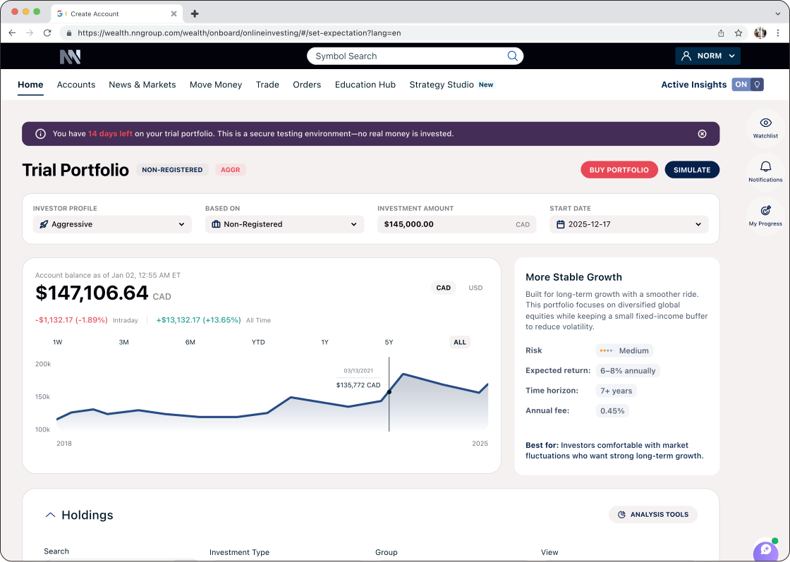
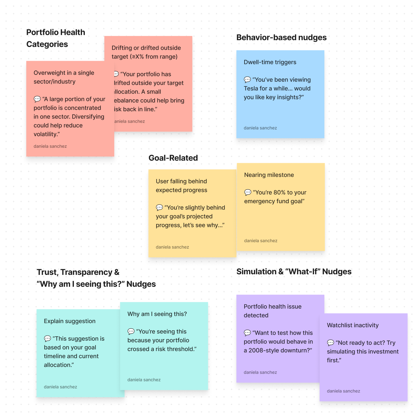
BMO InvestorLine — Home BMO InvestorLine — sticky notes discovery
01 — The Challenge

The real problem wasn't friction. It was fear.

Discovery ran two tracks: workshops with stakeholders, and existing research the client shared — interviews with 5 advisors who reported what users told them every time they called for help.

Key research insight

Users weren't calling advisors because they wanted advice. They were calling out of fear — afraid to act alone on a platform they didn't understand or trust, afraid of making the wrong financial move. They couldn't find features. They couldn't interpret what they were seeing. When stuck, calling a human was their only option. That's the problem we were actually solving.

01Portfolio data was fragmented — users couldn't see the full picture
02Trades lacked clarity on risk, diversification, and tax impact
03Users who completed onboarding didn't know what to do next — the platform handed them control without a map
04Educational content existed but was disconnected from real decision moments
05Users couldn't tell which insights were actually relevant to their situation
06The accumulated friction eroded confidence in trading and portfolio management overall
The existing experience

The platform had an "advice" section — a panel that monitored preset thresholds and flagged when something crossed the line:

"You have investments with low ratings. Sell investments with a rating of 49 or less."

No context. No connection to who the user was, their goals, or their actual risk capacity. The same alert appeared whether you were a 30-year-old aggressive investor or a 60-year-old retiree. Users saw rules, not reasons.

How might we help users make better financial decisions — without taking control away from them?

02 — Framing the Opportunity

Users don't want automation. They want confidence.

The goal wasn't to build an AI. It was to make the platform feel like it was on the user's side. We started by reframing the platform itself — not as a toolset, but as a guidance system — then focused on three things:

01
Surface the right insight at the right moment
Contextual guidance woven into the workflow — not buried in a help section
02
Make consequences visible before users commit
Show the impact of a decision before they click confirm — not after
03
Guide without dictating
Preserve full user autonomy at every step — the system informs, the user decides
CIRO constraint

BMO InvestorLine is a self-directed (order-execution-only) platform. Under CIRO rules, that model exists because the firm doesn't make recommendations — which keeps it exempt from the suitability obligations a full-service advisor carries. The AI could never tell a user what to do. The real challenge: surface enough context for a confident decision without ever tipping into advice. Every screen had to guide, never instruct.

03 — Approach

Stakeholder alignment was the hardest part.

7 months combining research, product definition, and rapid experience design across three journeys.
🗣️
2-week discovery sprint
Workshops + 5 advisor interviews shared by client, reporting user fear and platform distrust
🗺️
Journey mapping × 3
Onboarding, portfolio understanding, trade — found highest-friction decision moments
✏️
Rapid concept exploration
Ideas on paper before committing to pixels — fast iteration across teams
🔬
Usability testing
Validated design direction before going high-fidelity
⚖️
3 experience principles
Kept design decisions consistent across all three journeys
Key insight from discovery

The existing "advice" functionality wasn't advice — it was threshold monitoring. No awareness of who the user was or what they were trying to achieve. Design foundation for J2: stop monitoring thresholds, start connecting to the person.

Designing for trust — 4 tensions every screen had to navigate
Trust vs. Automation

Users needed to feel supported, not overridden. Every AI insight had to preserve their sense of control.

Simplicity vs. Accuracy

Financial data is complex. We simplified explanations without losing meaning.

Timing of Intervention

Guidance needed to appear at moments of uncertainty, not constantly — or it would feel intrusive, not helpful.

Explainability

Every AI-generated insight had to be transparent and grounded in data. Black-box answers break trust in a financial context.

04 — Users

Two profiles. One shared need.

BMO defined two audiences. I mapped their shared needs and the tensions between them — they drove every design decision.

EW
Profile 01
Experienced wealth investors
Baby boomers managing significant household assets
Goals
Full portfolio visibility and fast access to insights
Maintain control — no hand-holding
Confidence managing significant assets independently
Frustrations
Guidance that feels patronizing or redundant
Fragmented data across multiple views
NI
Profile 02
Next-gen digital investors
Digital natives inheriting or building their own wealth
Goals
Intuitive, self-service experience
Build confidence without calling an advisor
Understand the impact of decisions before making them
Frustrations
Fear of making the wrong financial move
Guidance buried where it doesn't help
Design tension Advanced users risk being patronized by too much guidance. Newer users get lost without it. The design had to work for both — helpful when needed, invisible when not.
Shared need

"Understand what's happening in my portfolio, know what to do next, and feel confident enough to act — without calling an advisor."

User Journey

From anxiety to confidence — by design.

We mapped the emotional arc to find where trust breaks down and where guidance has the most impact.

😰
Arriving
Lost in data
"I see the numbers but not what they mean."
🤔
Exploring
Searching
"I found an insight but I'm not sure it applies to me."
😬
Deciding
High stakes
"I want to trade but don't know what happens if I do."
😌
Understanding
Clarity
"I can see exactly what this does to my portfolio."
😊
Confident
In control
"I made the decision myself — and I knew why."
05 — The Solution

Not a chatbot. A guidance layer woven into the moments that matter.
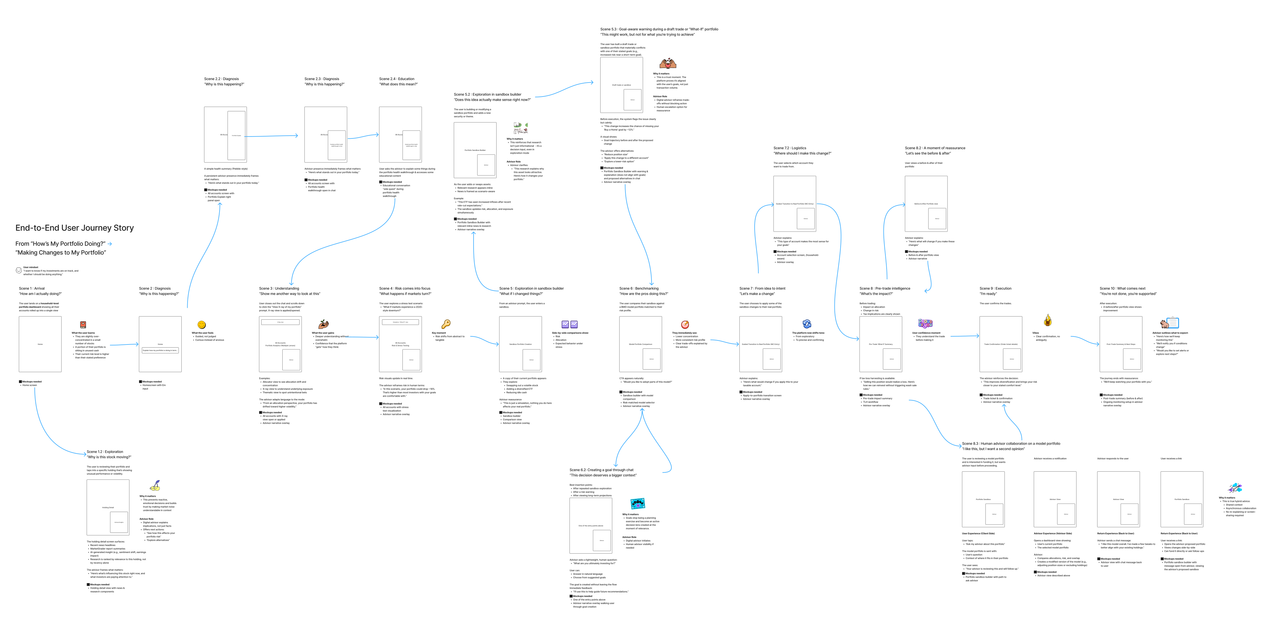
Every design decision came back to one question: does this help users understand what's happening and act with confidence?

BMO InvestorLine — user journey map
01
Portfolio Understanding

Turn confusion into clarity.

Users frequently check their portfolio but struggle to interpret what they see. Raw numbers don't answer the question they're actually asking: "Why did my portfolio move?"

We introduced AI-generated explanations that answer it directly — summarizing performance in plain language, highlighting key drivers like market trends and specific holdings, and letting users drill down at their own pace. Instead of raw data, the platform delivers narrative insight — helping users learn while they invest.

We extended this into benchmarking: users compare their portfolio against a BMO model matched to their risk profile, and immediately see what's different and why. The platform then invites, never instructs.

Design decision

The existing advice panel evaluated portfolios against static thresholds — it could tell you your rating was too low, but not what that meant for your goals or risk capacity. The shift: connect portfolio health to who the user is and what they're trying to achieve, not just to preset rules. A narrative before a decision is more valuable than more data.

Portfolio health — goal-linked guidance
Before / After — From Threshold Monitoring to Goal-Linked Guidance
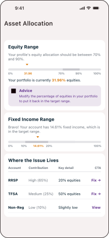
Before: The advice panel

A dedicated section that flagged when allocations crossed preset thresholds. Same logic for every user regardless of goals, timeline, or risk profile.

Before: Asset Allocation advice panel
The problem
Tells users their allocation is wrong. Doesn't explain what that means for their goals, when it matters, or what the consequence of inaction is.
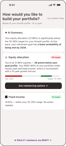
After: Goal-linked guidance

Portfolio health connected to who the user is — their goal, timeline, and risk profile. The platform explains what the gap means, not just that it exists.

After: Portfolio Health redesign
The shift
Same data. Different frame. The platform now explains what the gap means for this user's specific goal — and opens a path forward instead of a dead end.
02
Embedded AI Assistant

Always available, never intrusive

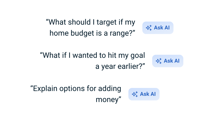
In early concepts we designed a dedicated AI hub — a separate screen for guidance. In usability testing, users ignored it. They weren't looking for a separate destination; they expected help to appear exactly where they were making a decision.

So we moved guidance inline. AI became part of the experience itself — explaining decisions in plain language, answering questions in context, surfacing what's most relevant. The reasoning behind every insight is visible, not hidden.

Design decision

In early concepts we explored a dedicated AI hub — a separate screen for guidance. Users ignored it. The insight: guidance needs to live where decisions happen. Moving everything inline, to the exact moment of decision, is what made it feel useful.

Embedded AI Assistant — inline guidance
03
Pre-Trade Intelligence

Help users act with confidence

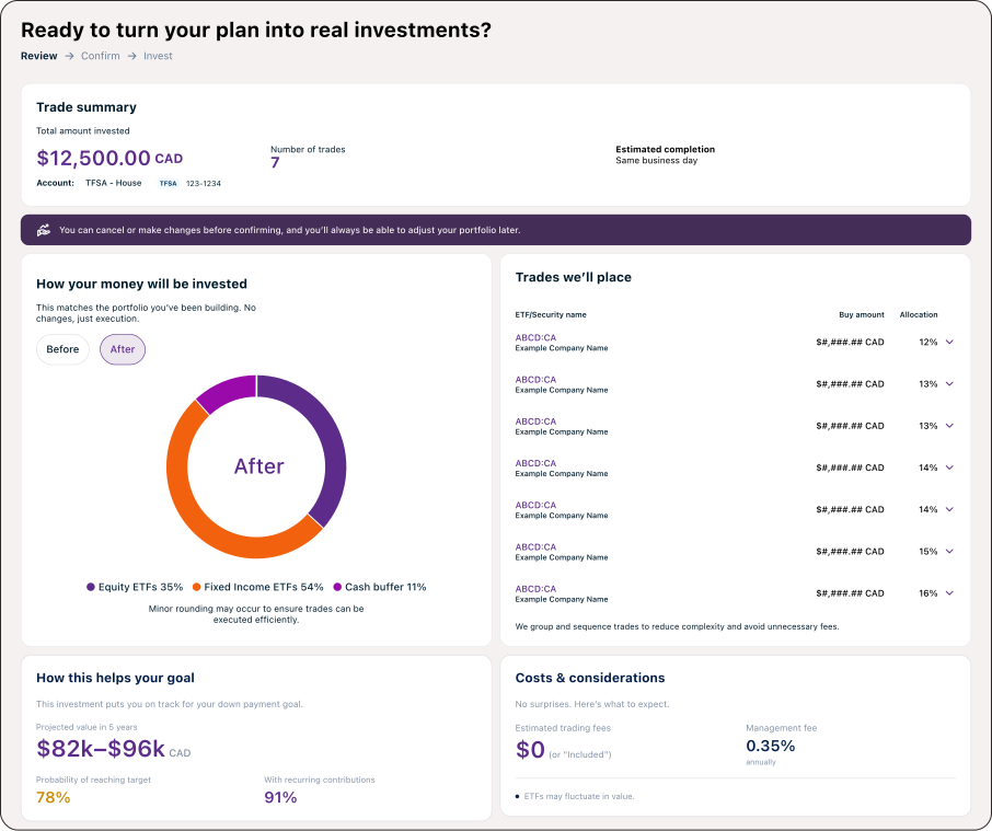
Executing a trade is the highest-stakes moment — and the moment most platforms abandon the user. The standard flow: ticker, quantity, price. What it doesn't tell you: what this does to your risk, diversification, goals.

We designed one step earlier. Before the user commits, the platform surfaces what matters. They can ask — "How will this affect my balance?" — and get a contextual answer tied to their specific situation.

Pre-Trade Intelligence — contextual insight before executing
04
Learn by Doing

Build confidence through action, not instruction

New investors weren't afraid of the platform — they were afraid of themselves. Afraid of making a move that couldn't be undone. The usual response: more education. We tried a different approach.

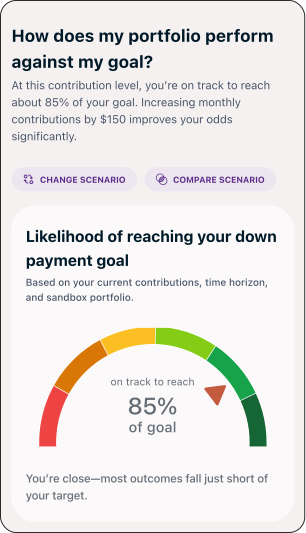
The sandbox lets users try a trade, see the exact impact, and decide whether to execute for real. Nothing commits until they say so. Confidence comes from doing, not reading.

Learn by Doing — sandbox trade simulation
05
Scenario Exploration

Shift users from reactive to proactive thinking

Most investment decisions happen reactively — the market moves, the user panics, they act. The What If? tool breaks that pattern by making consequences visible before a decision becomes urgent.

The AI's role isn't to choose. It's to make the user's choices legible. Autonomy only feels real when you can see the road ahead.

Scenario Exploration — What If tool
06 — Roadmap & MVP Definition

From vision to a phased build.

Rather than launching everything at once, we defined a progressive rollout — clarity first, then decision support, then personalization.

Phase 01
Clarity First
Give users a clear picture of where they stand
Portfolio health — allocation, diversification, risk
Plain-language performance explanations
Contextual prompts introducing guidance
Outcome: Users understand their portfolio without calling an advisor.
Phase 02
Decision Support
Support high-stakes moments in the flow
Pre-trade insights — risk, diversification, goals
Scenario exploration — "what happens if I proceed?"
Guided flows for portfolio adjustments
Outcome: Users move from uncertainty to informed action.
Phase 03
Proactive Guidance
Anticipate needs and personalize over time
Smart alerts tied to portfolio health and market events
Personalized recommendations based on behavior
An assistant that evolves with the user
Outcome: Platform shifts from reactive tool to proactive partner.
07 — Outcomes

Three journeys designed. One shipped, all applied.

The engagement ended with a pivot: Journey 1 (Onboarding) was selected by the client for development and delivered for implementation. Journeys 2 and 3 weren't shelved — their concepts were applied to the empty state experience, the design for users who haven't yet opened an account.

3
Journeys designed
end-to-end
1
Journey selected
for implementation
5
Features designed
end-to-end
3
Stakeholders aligned
across product + eng
The empty state

A design for users who haven't yet opened an account — to let them explore the platform before committing. Journey 2 and Journey 3 concepts (portfolio understanding, pre-trade intelligence, scenario exploration) were applied here, giving the experience depth even before a real portfolio exists.

Owned Journey 2 end-to-end — redesigned how the platform communicates portfolio health, from threshold warnings to goal-linked guidance
Journey 1 selected for implementation — Onboarding journey delivered to the client and chosen for development
J2 + J3 concepts applied to the empty state — portfolio understanding and scenario exploration extended to pre-account users
3 stakeholders aligned across product, engineering, and business on a shared north star
High-fidelity prototypes for all 3 journeys, tested and iterated with users
Phased roadmap — from near-term J1 delivery to longer-term personalization
Handoff package delivered for next-stage implementation
Experience concepts linked to KPIs — NPS, CSAT, trade volume, and guidance engagement defined as success measures
Reusable design patterns for guided decision-making that scale across the platform
Learnings

What I took away.

01
Stakeholder alignment is a design problem too
Prototypes weren't just deliverables — they were the main tool for getting everyone on the same page.
02
Embed AI, don't centralize it
A dedicated AI screen gets ignored. Context matters more than capability. Guidance needs to live where decisions happen.
03
Confidence is a design outcome
In financial UX, a user who understands what's happening is more valuable than one who has every data point.
What I'd Improve Next

Given more time, here's where I'd go.

Run longitudinal studies to measure real impact on confidence and trade behavior
Add user-controlled guidance levels — research showed people want different amounts of help
Give the onboarding journey another concept testing round — it needed more time
Closing thought

Designing for financial decisions isn't just about usability — it's about responsibility.

The goal isn't to make decisions for users, but to help them make better ones.